There’s still time to optimize your Amazon product detail pages before the busy holiday shopping season. Use these 4 tips to make your products more compelling to shoppers.
We’re nearly a month into Q4 and it already feels crazy around here. I imagine things feel the same way around your office, too. While you’re busy double-checking that you’ve met all of your deadlines, ramping up advertising, and preparing for Black Friday and Cyber Monday, you might be forgetting one thing: your Amazon detail pages.
Luckily for you, there’s still plenty of time to optimize them for maximum conversions this holiday season. You owe it to yourself—especially since you’ve spent so much time and money getting shoppers to your product pages in the first place! Here are four ways to improve your Amazon product detail pages this holiday season.
Tip 1: Double-Check Your Amazon Detail Page Fundamentals
Images
If a picture is worth a 1,000 words, then one on Amazon is worth tens of thousands—if not millions—of dollars! Your product images are the single most important asset you can control on Amazon.
You could have the best SEO and advertising strategy in the world bfut if your product images are garbage, people aren’t going to click through and they certainly won’t buy—unless they’re desperate and have no other option.
For most product categories, Amazon gives you six photo slots. Your lead image must be on a white background but the other photos can be what you deem suitable. Check out this helpful video about Amazon’s image requirements.
Key elements to great Amazon product images:
- Maximize visualization with high-resolution images
- Feature the product on a white background
- Showcase product packaging, important features, lifestyle images, and product size/scale
- An infographic that explains how to use the product in a certain situation
Product Title
The title is the second thing shoppers will see after the image when searching. If your product title isn’t descriptive then you’re only doing yourself a disfavor. So what does an effective product title need?

Things to include:
- Brand name
- Features
- Size
- Model
- Type
- Size
- Material
- Color
- Construction materials
Things to avoid
- Keyword stuffing
- Incoherent titles with no tangible description
- Exclamations points!!!!!
- Deals, offers and sales
Product titles need to be shorter than 200 characters including spaces. Your product will be suppressed from search if the title is too long.
Bullet Points
The bullet points section is where you can go into depth about the features and highlights of the product. You should use all five available spaces. Showcase the most important uses. Write them to be skimmable. Many sellers will capitalize on keywords for easier reading.
Use keywords that describe what your product does and not necessarily what it is. Make sure you’re highlighting the benefits of the product. Chances are shoppers won’t scroll beyond your bullet points—so make them count.
Product Description
Your product description is where you’ll want to double down on long-tail keywords and descriptions. Consider the questions you would have if you were researching a product like the one you sell. What would compel you to purchase it?
Education is key in this section. Talk about the product’s purpose and how it’s a better solution compared to the competition. Remember, this is your opportunity to provide the level of insight and confidence that buyers need in order to buy.
Tip 2: Use and Improve A+ Content Pages
A+ Content was recently renamed from Enhanced Brand Content but its functionality and features remain virtually the same. First and foremost, you must be enrolled in Amazon’s Brand Registry program to take advantage of this feature.
A+ Content is where you can tell and sell your brand’s story. Approach A+ Content entirely different than you would the top part of your detail page. Whereas above you’re focused on attracting shoppers to your detail page and keeping them there, A+ Content is where you get to sell.
Bold Branding
A common trait you’ll see amongst the best A+ Content pages is strong branding at the top. This is typically shown through bold visuals and branding. The core product is also shown along with the logo. The point here is to communicate what your brand is about to the shopper in an instant.
Value Proposition
Just below the header image of the page, you’ll find the product and brand’s value proposition. This section is meant to inform the shopper about the main benefits the product has to offer. This is not the time to focus on key features. You want to explain what your product is and not what it does.
Lifestyle Images
Images in A+ Content pages should be heavily focused on lifestyle. You want to highlight your product in its optimal use and environment—preferably with people. Don’t duplicate your photos from the top carousel here. This is your opportunity to provide the shopper with even more compelling visuals that entice them to buy.
Use Cases and Key Features
The bottom of your A+ Content page is where you should talk about features. This is a good place to explain what your product does, what people should expect when using it, and key competitive differentiators.
Tip 3: Update Your Backend Keywords
The backend keywords section for your Amazon product listing is found in Seller Central in your product catalog for a given ASIN. These keywords are hidden, meaning that they won’t be displayed on your detail page. They are used to give Amazon additional information about your product listing. Amazon indexes them for display in search.
Tips and Tricks
- Stay within the 249-byte limit
- Include popular abbreviations and alternative names
- Refrain from using irrelevant keywords
- Don’t repeat keywords
- Avoid duplicating keywords in titles and bullets
Tip 4: Always Be Testing and Optimizing
The last thing you should do with your detail page is “set it and forget it.” Doing so will result in diminishing returns over time. You need to always be testing your images, titles, bullet points, description, keywords, and A+ Content.
But how do you go about testing?
Experiments Learning Center
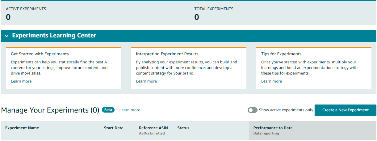
Amazon quietly rolled out its new Experiments Learning Center for A+ Content, which gives sellers the power to test content for their listings. Not much has been said about this new feature but the fact that it exists shows Amazon’s commitment to improving listings for conversion.
PickFu
PickFu is a feedback platform that uses a US audience made up of thousands of consumers who can give you feedback on your images, titles, descriptions and pretty much anything else. Understand that these tests are conducted off of Amazon, but you can implement the results from your tests into Amazon.
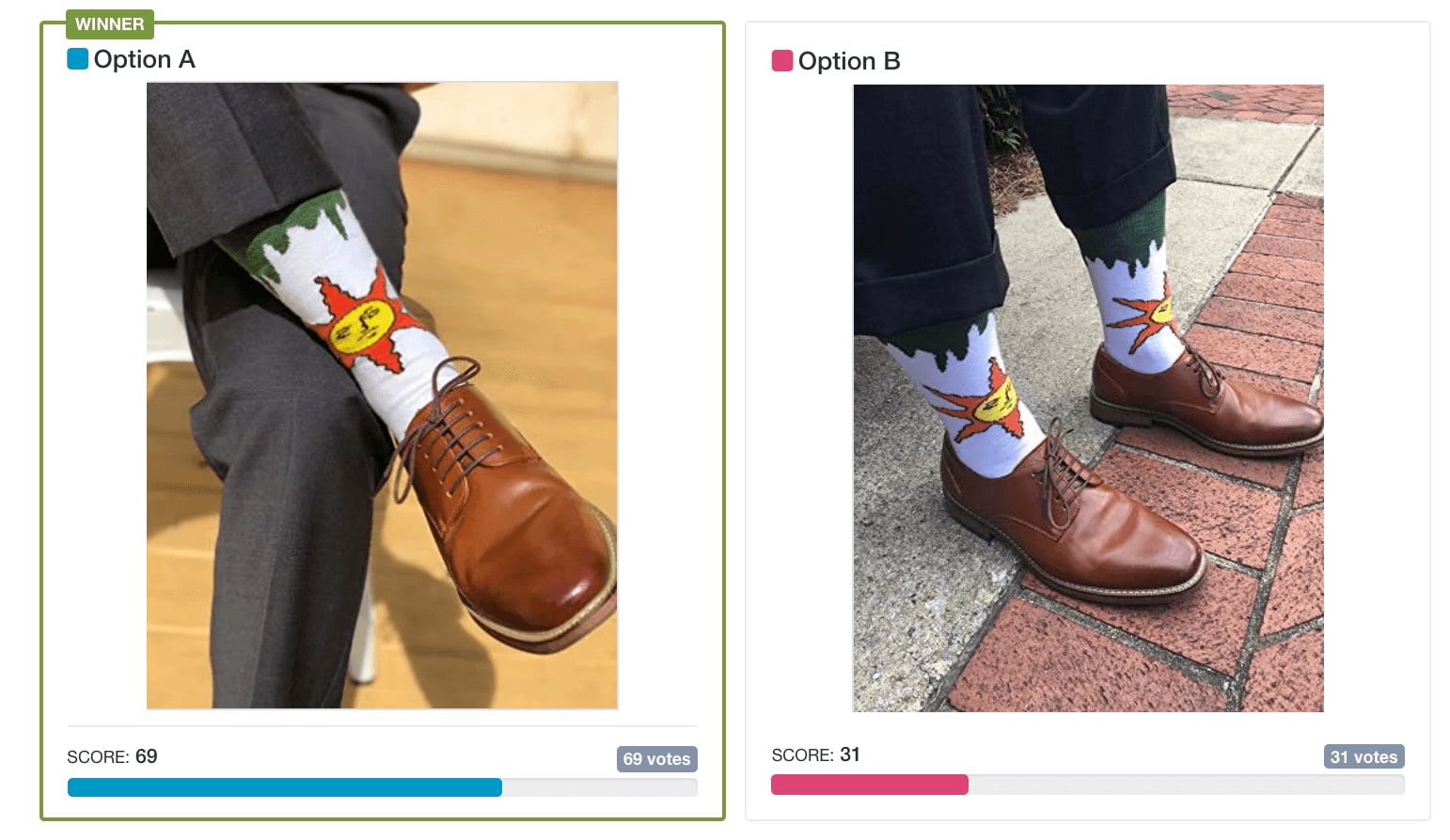
We ran a couple of image tests for a seller we know on PickFu and received some interesting results. The seller wanted to know which photo resonated better with an audience. You can see that the first photo was a clear winner with 69% of the votes. The seller then put this information to work by swapping out the images on their Amazon detail page.
Final Takeaway
Now that you have an idea of where to begin optimizing your product detail pages, it’s time to start. You don’t have to invest several hours of your time to begin either. You can start small by swapping out your images. You can tweak your product title a little bit. Just make sure that you’re keeping track of the changes you’re making in a spreadsheet or a document. That way if you don’t see improved results you can switch back to what you had before.
And if you’re looking to improve your messaging, advertising, keywords and analytics this Q4 then look no further than Seller Labs Pro. You’ll get the power of four fundamental Amazon selling tools at one package price.

